

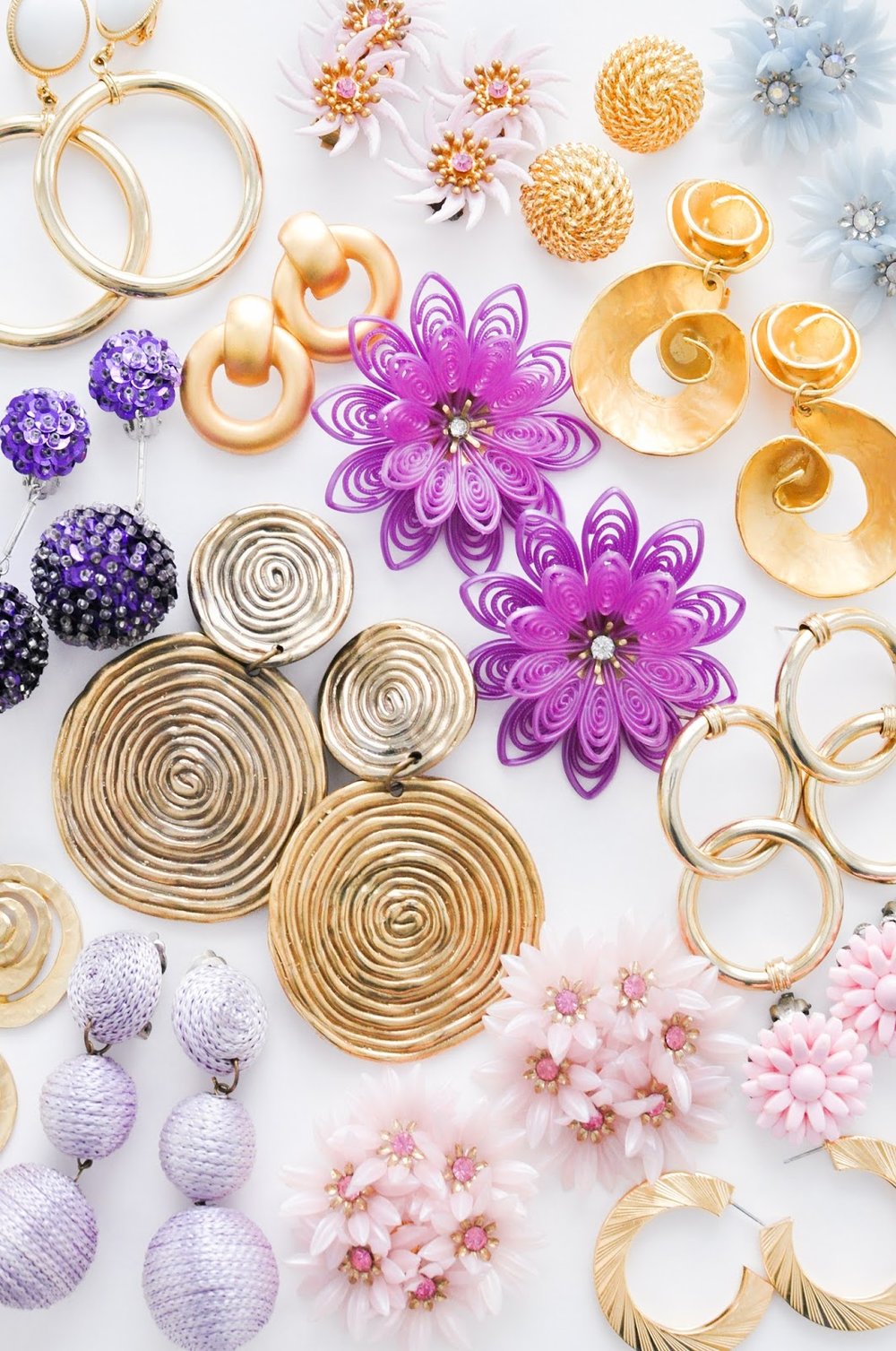
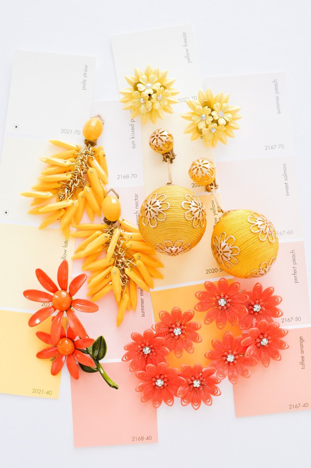
I shared a bit about the magic that went into creating our Summer collection at Sweet & Spark a few weeks ago, including putting together a seasonal color palette filled with citrus oranges, pinks and lilacs. Personally, I LOVE paint swatches and pantone chips, holding them, collecting them, grouping them... Must be a fashion design industry tradition that really stuck with me. It is a great place to start when developing concepts for a new season. For instance, pastels work beautifully for Spring, and brighter colors are a good fit for Summer. Within each of those color realms, are a lot of options.
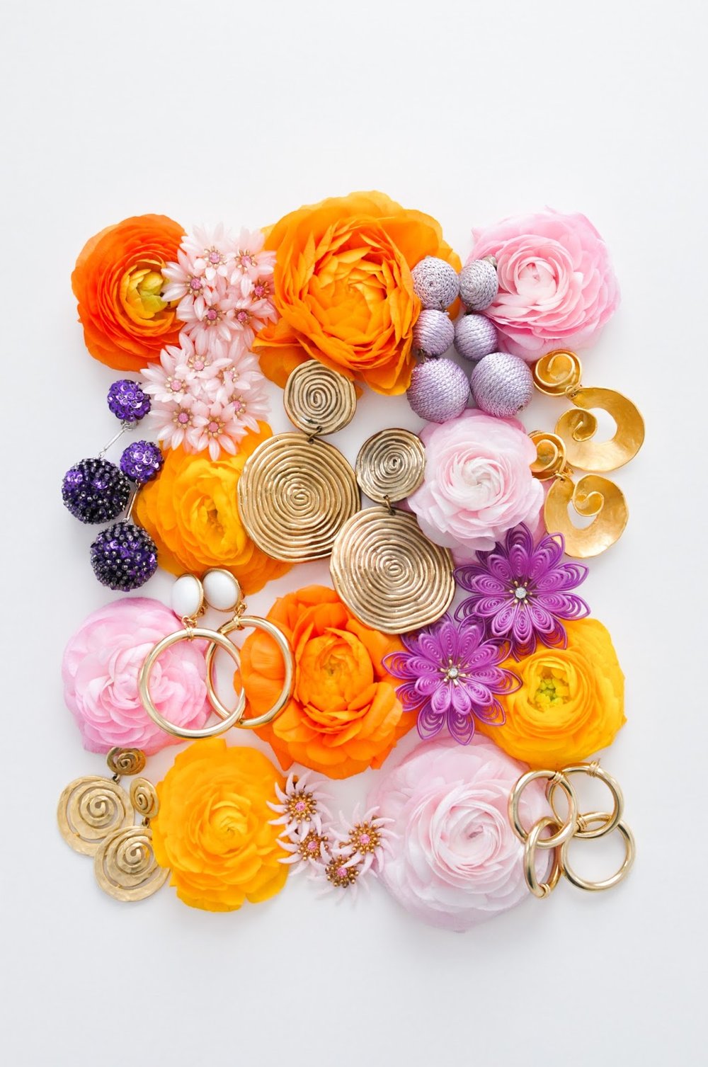
To start off I love pulling magazine images and tucking them away in one big folder throughout the year, sort of like Pinterest in real life! At the beginning of each season, I will pull out my big folder and set aside the pages that feel relevant. From there, I will dig around on the internet (where I also save images into dedicated folders on my desktop) and compile an overall aesthetic and mood folder based off relevant themes. Based off all these found images, I'll create a photo collage and eye drop about 5-10 seasonal swatches to hand off to Jillian for buying, and our graphic design team for creative assets.
S H O P T H E L O O K